TPH STYLE GUIDE
Logo files, guidelines, and branding elements.
Welcome! Here you can find our most up-to-date logo files. See below for use of guidelines and branding elements.
Please note: when the TPH logo or branding is used internally or externally, the file must be submitted for approval to trademarks@tph.ca.
Please send internal requests for marketing support and design approval to TPH Marketing – Ray Welsh at rwelsh@tph.ca.
- Primary Logos
- Wordmarks
- Print Sponsor Logos
- TPH Charitable Logos
- Health, Safety & the Environment Logos
- Social Icons
- Webmark
- Legacy Symbol
- Colour Variations & Matching
- Sizing & Space
- Incorrect Usage
- Brand Colours
- Brand Typography
- Graphic Elements
- Signage Guidelines
Primary Logos
This is the primary TPH logo and should be used consistently across all communications. There are different orientations of the logo to allow for design flexibility.

Primary
Should be used across all communication.

Stacked
Should be used only where the primary logo will not fit due to size restrictions.

Primary Reversed
Use this logo on dark backgrounds.

Stacked Reversed
Use this logo on dark backgrounds where the primary reversed logo will not fit due to size restrictions.
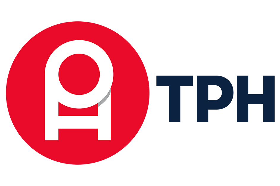
WORDMARKS
WORDMARK REVERSED
Use this logo on dark backgrounds.
Print Sponsor Logos

Primary
Should be used when TPH is sponsoring or donating print materials.

Stacked
Should be used when TPH is sponsoring or donating print materials and the primary print sponsor logo will not fit.

Primary Reversed
Use this logo on dark backgrounds.

Stacked Reversed
Use this logo on dark backgrounds where the primary reversed logo will not fit due to size restrictions.
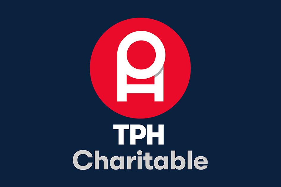
TPH Charitable Logos

Primary
Should be used across all Charitable Office communication.

Stacked
Should be used for narrow situations where the primary Charitable Office logo will not fit.

Primary Reversed
Use this logo on dark backgrounds.
Stacked Reversed
Use this logo on dark backgrounds where the primary reversed logo will not fit due to size restrictions.
Health, Safety, & the Environment Logos

Primary 1.0
Use this logo to represent the Health, Safety, & the Environment committee.

Primary 2.0
A secondary logo to represent the Health, Safety, & the Environment committee.

Stacked 1.0
Mount your poster to a presentation board, ideal for easel display or hanging installations.

Reversed 1.0
Use this logo on dark backgrounds.

REversed 2.0
Use this logo on dark backgrounds.

Stacked Reversed
Use this logo on dark backgrounds where the primary reversed logo will not fit due to size restrictions.
Social Icons

@TPHCANADA


Webmark

TPH.CA
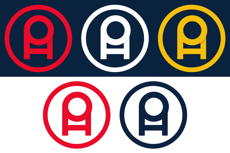
Legacy Symbol

The red symbol may be used on its own where appropriate. For example, it is used on TPH social channels to ensure it is as large as possible for maximum impact. It may also be used as a design feature, but not accompanied by any text.
The dark blue and yellow symbols may be used as design features, but should not be accompanied by any type.
Any use of the legacy symbol must be approved through trademarks@tph.ca.
RED
NAVY BLUE
YELLOW
Linear Legacy Symbol
The red and white linear symbols may be used on their own where appropriate. For example, in instances where the logo would be smaller than the minimum size. It may also be used as a design feature, but not accompanied by any text (see backgrounds example).
The dark blue and yellow linear symbols may be used as design features, but should not be accompanied by any type.
All usage of the linear symbols must be approved through trademarks@tph.ca.
RED
NAVY BLUE
YELLOW
WHITE
Colour Variations & Colour Matching
The colour values are indicated for printing. All logos must follow the TPH brand colours, the shadow in the logo changes according to the logo colour. The coloured variations of the Legacy Symbol are not to be used in conjunctions with the TPH text.
Red logo
RED CIRCLE:
PANTONE 185 C
C0 M100 Y89 K0
R228 G0 B43
#E4002B
GRAY SHADOW:
P COOL GRAY 6
C33 M24 Y20 K2
R167 G168 B169
#A7A8A9
BLUE TYPE:
PANTONE 289 C
C100 M66 Y0 K76
R12 G35 B64
#0C2340

Blue Logo
BLUE CIRCLE:
PANTONE 289 C
C100 M66 Y0 K76
R12 G35 B64
#0C2340
GRAY SHADOW:
P COOL GRAY 6
C33 M24 Y20 K2
R167 G168 B169
#A7A8A9

Yellow logo
YELLOW CIRCLE:
PANTONE 7408 C
C0 M20 Y98 K0
R246 G190 B0
#F6BE00
GRAY SHADOW:
P COOL GRAY 3
C18 M13 Y10 K0
R200 G201 B199
#C8C9C7

BLACK LOGO
BLACK CIRCLE:
C0 M0 Y0 K100
R35 G31 B32
#231F20
GRAY SHADOW:
C0 M0 Y0 K10
R230 G231 B232
#E6E7E8
Sizing & Space
Please consider visibility when determining logo placement.
- Primary Logo: 1.5” Wide
- Stacked: 0.5” Wide
- Legacy Symbol: 0.5” Wide
If for any reason the logo minimum size requirements can’t be met, it will be managed on a case-by-case basis upon submission for logo approval via trademarks@tph.ca.
The logo should always stand out. The safety zone separates the logo from other graphic elements or type that may detract from its impact. The grid illustrates the area in which no other element may appear. The minimum clear space around the logo should be half of the inner circle width of the legacy symbol.
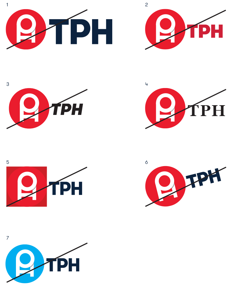
Incorrect Usage
When the rules of the identity are broken, the visual system becomes weakened and confusing. The following are examples of how the TPH logo should not be used.
- Do not change typeface size.
- Do not change typeface colour.
- Do not italicize typeface.
- Do not change typeface.
- Do not change the shape of the symbol.
- Do not change the orientation of the logo.
- Do not change the colour of the symbol.
Brand Colours
Colour is an integral part of the TPH identity system. Always use the Pantone, CMYK, RGB and Hex values as they are listed here.
Values sourced from: https://www.pantone.com/color-finder
 | PANTONE 185 C C0 M93 Y79 K0 R228 G0 B43 E4002B |
 | PANTONE 289 C C100 M76 Y12 K70 R12 G35 B64 0C2340 |
 | PANTONE 7408 C C0 M29 Y100 K0 R246 G190 B43 F6BE00 |
 | PANTONE 5415C C56 M24 Y11 K34 R91 G127 B149 5B7F95 |
 | P COOL GRAY 2 C5 M3 Y5 K11 R208 G208 B206 D0D0CE |
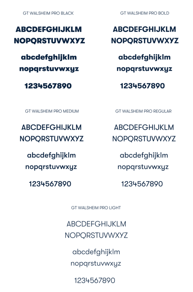
Brand Typography
Typography is an integral part of the TPH identity. The font family we use is GT Walsheim Pro.
For font files, please contact trademarks@tph.ca.
Graphic Elements
These graphic elements were developed using the linear legacy symbol. Patterns can be used as graphic textures and backgrounds. Different crops of the symbol are featured to add visual variety. Please send all use to trademarks@tph.ca.
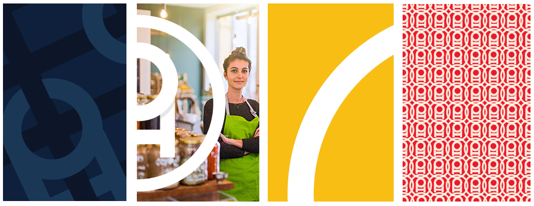
Patterns for Download:
SIGNAGE GUIDELINES
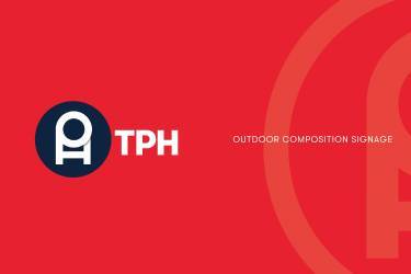
SIGNAGE GUIDELINES
Use this logo on dark backgrounds.